|
The first out-of-class critique that I sought out was from my boyfriend's step-mother, whom I'll just refer to as "N" for this post. N is a certified nurse at Flagler Hospital, but also has a side career as an illustrator. She paints and her subject matter ranges from very detailed, trip mandalas to abstracted nature scenes. She noted that as I progressed with these works, my style became more abstracted- perspective more wonky and less traditional. However, she believes that the last painting that I did, which I will be posting after this reaction. She liked that I was willing to be less conventional at times and that I experimented with patterns and texture in my first finished piece, however she suggested that I work on tying them in with the rest of the picture a bit better, which is not the first time that I've been told that and I definitely want to experiment more with that advise in mind. My color choices are well executed, she said, and mentioned that she prefers the bolder palettes to the more subdued and muted choices that I had made and suggested that I look at Max Ernst's work for some inspiration. Lastly, she suggested that I added in more texture to some areas at least in foregrounds- she said that I seem to be evolving into a more cubist style and suggested that I research Mondrian and study how he used texture in his approach. Overall, I thought that she had a lot of very useful things to say and greatly appreciated that she was willing to take time out of her day to help me out. Whens she pointed out that I needed to add in more texture, I let her know that I had been nervous about doing so as I didn't know how to approach it. I liked receiving an outside point of view- aka: from somebody who has not seen the entire process that went into making it all and I found it to be a very rewarding experience. especially when I let her know that I did not feel very confident about the pieces and she reminded me that I don't have to. They're just stepping stones that are meant to help me learn more about my style and I should keep them as a way to look back at how I've progressed. 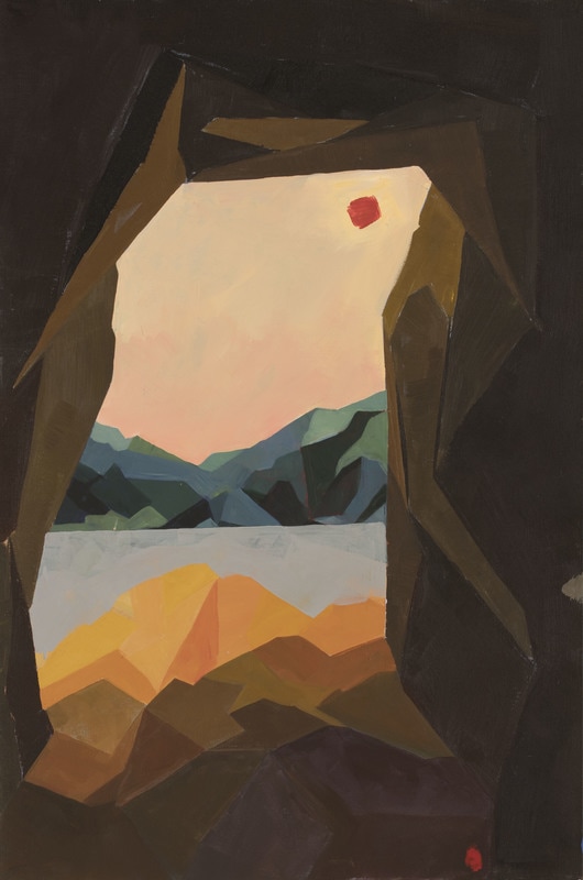
0 Comments
So over the weekend, I had the time to finally visit some of the art galleries around St Augustine. I already work at one, and so many times customers have told me how different the work shown there is from what other galleries have to offer, so I was glad to finally have the opportunity to go forth and see what they had been talking about. The first two that I visited were ones that are, in my opinion, the most well-known in St Augustine, given their extensive collections and the notoriety of some of the artists who show in them. I've been tot he Cornerstone Gallery before, when it was still the Galleria del Mar, and I was disappointed to see that some sketches by Salvador Dali and Miro were no longer there. However, there were a couple of artists' work that I became very interested in: The first were works that appeared to be a sort of colored resin on glass, and created some beautiful imagery that looked like it was coming off of the surface. Some were very spacey and looked like that could have been supernovas, while others were more minimal and displayed drinks and such. The other works that I liked appeared to be scenes from a drive-in movie theater, where the audience was watching Star Wars. However, the screens seemed to be depicting collages of the the characters, rather than screen shots. I liked them not only because I love the Star Wars universe (except for episodes 1 and 2), but because the environment that surrounded the screen seemed to be another world. The colors were bright and captivating, and I liked the juxtaposition of space and the past. Next I went to the Cutter and Cutter Gallery, Brilliance in Color, and I found out where the Dali sketches had gone. Still no sign of Miro's work, though. Having been to the Dali museum in Tampa, i was a bit disappointed to see that the gallery did not hold a lot of works which really displayed his wide range of artistic talent. But that does not necessarily mean that what was shown was any less beautiful. There were also some beautiful paintings of female figures in indiscriminate spaces that I really loved by Josep Domenech. I felt that he really appreciated the female form and wanted to truthfully represent womanhood. He had an interesting balance between intricate detail and unidentifiable spaces, and his muted color palette really gave a sense of nostalgia tot he pieces. My favorite gallery that I visited was the Lost Art Gallery, which held works depicting a wide range of subject matter. Some took on amore classical approach, while others a more contemporary. There were photographs that I had seen a few months ago while I'd been working one day and a woman came in asking that her husband's work be considered for display, and while it did not work out with us I was pleased to see that this gallery had picked them up. The photographs depict life in Bulgaria and are formally very beautiful. I especially love one of a little girl who is proudly holding onto a chicken, as the stark value contrasts contribute to a sense of adolescent innocence and optimism.
It's official, I have been published in Inklette Magazine! I it's an online magazine, so I know that I won't necessarily get a hard copy of the issue, but I'm still excited and will be posting everywhere when it's up! 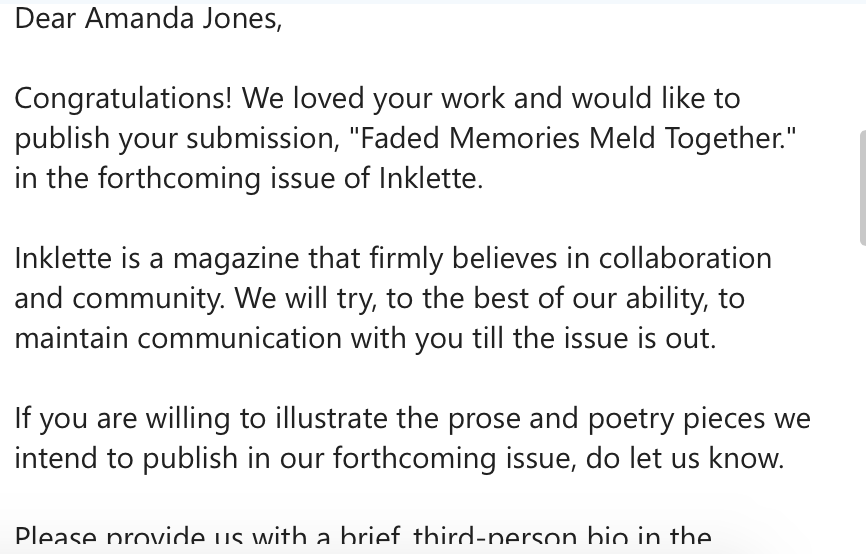 In other news, I think that I've made some headway on my pieces for portfolio. Now that I only have the one job, I've been much less stressed and I've also had more time to think about what I want to do. So I spent almost all day working yesterday, and then I woke up at 5:30 this morning and worked some more and I'm feeling much better about where I am than I did last week. I inadvertantly stumbled into a more cubist style which has been feeling fresh and interesting, and I like to think that I'm mimicking Cezanne- not quite in color theory, but in color palette maybe? I've included two photos of my failed street-view because that became the base for the rectangular painting on the left in the final picture I've submitted a couple of artworks to a magazine publication that I found through Submittable, a website that my professor suggested. The theme of the submission was "Home", and I decided to submit a photo of the larger landscape that I created, as well as a piece that I did for my Contemporary Drawing Practices class last semester. I chose these two pieces because I feel that they both communicate different emotions related to the concept of home: one is nostalgic and fantastical- the other is muddy and a bit threatening. At least, that is how I view them. |
AuthorArt Student at Flagler College. I am frequently instructed to write blog entries about my artistic thoughts and process. Archives
April 2017
Categories |
 RSS Feed
